I’ve been working behind the scenes with one of my favorite designers on all new branding for Sarah Hearts! I cannot wait to share it all with you! In the meantime, I’m working on sprucing up a couple things here and there to get ready for the rebrand.
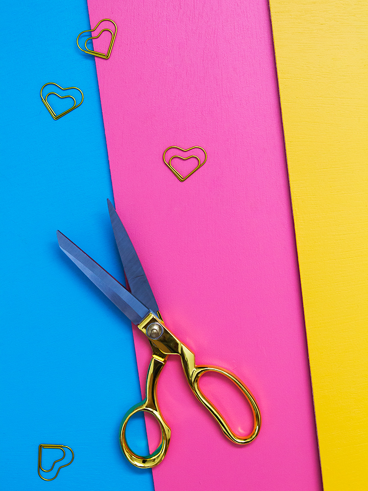
One of the things on my to-do list was to create some new photo backdrops in my new color palette. So when my friend Rachel posted about creating her own photo backdrops last week, I finally went to the store and picked up supplies to make my own! With just a few supplies, I created 6 bright and oh-so-Sarah Hearts backdrops that you will soon see in lots of photos.

Time: 15 minutes + drying time
Supplies: plywood panels / house paint samples / 4″ foam roller and paint tray
I went to Lowes and matched Valspar paint samples to my new color palette. I had each color mixed in a sample size. They are a great value for a ton of craft projects! They are so much cheaper (and way easier) than custom mixing the color yourself with craft paint.
Want a pro-tip? Cover your paint tray with Press ‘N Seal. This one is a game changer you guys. No clean up after painting? Yes, please!

Use a foam roller to cover the entire surface of the plywood with paint. The foam roller covers quickly and leaves a perfectly smooth finish. You will likely need to apply 2-3 coats to get a solid look. I found it covered best when you rolled the paint on perpendicular to the wood grain. Just allow the paint to dry for 10-15 minutes between coats. Once you’re done, you can flip the board over and paint the other side a different color. Easy peezy and perfect for all kinds of photos!

Colors used are Valspar Rose Dust, Camille Pink, Afternoon Tea, Fountain Mist, Poppy Field, Rushing Stream
What’s your favorite photo backdrop? Leave a comment below and let me know!


I’m a new blogger, and I’ve been trying to figure out this whole backdrop game! This is a simply perfect solution. Thank you!
You’re welcome! And welcome to the fun world of blogging!
Insert the heart eyes emoji here.
So excited for all this implementation! Whoo! I think My favorite is the yellow!
Okay, that does it! Now I HAVE to try this project out!!! Can’t wait to see the rebrand =)
So smart! Thanks for posting this!
I love this Sarah! What a simple and effect way to get your brand and colouring across. Adding this one to my list fo sure :)
Thanks! I’ve really enjoyed the way it helps “brand” my photos too.
I love these! Do you know what finish the paint was? I don’t think you usually have a choice when it comes to samples, so maybe like satin? Anyway, they look great!
Thanks, Jess! You’re right, most paint samples are only offered in satin finish. The ones I used (all Valspar colors from Lowes) were also in satin finish but on the poster board they are matte enough and don’t reflect much light.
PRAISE! YOU SAVE ME. Literally, the best. Your DIY, aesthetic, brand, voice, editing, everything. obsessed. Wish I would have met you before you moved!!
You’re so sweet! I’m happy to hear this was helpful and I wish we could have met before I moved too!